Typography | Task 1: Exercises
22/4/24-27/5/24(week 1-week 5)
Gao Yuan Yi 0373945
Typography
Task 1: Exercises
Lecture
Week 1
a) Typo_0_Introduction
In this lecture, Mr. Vinod introduce us to typography, which can be seen in our daily lives and can be used in a wide range of different fields.
Typography is the art of creating letters. It is also animated and can infiuence wedding website design, app design, ect. It is important for designers.
Typograpgy has evolved over 500 years, from calligraphy to lettering, and finally to typography.
The arrangement of types includes selecting typefaces, point size, line length, line-spacing (leading), letter-spacing (tracking), and adjusting the space within letter pair (kerning).
The terms Typography also applies to the style, arrangement, and appearance of leeters, numbers, and symbols created by the process.
Font: A fonts refers to the individual font or weight within the typeface, l.e.:

Typeface: A typeface refers to the entire family of fonts/weights that share similar characteristics/styles, l.e.:

b)Typo_1_Development
1. Early letterform development: Phoenician to Roman
Initially writing meant scratching into wet clay with sharpened stick or carving into stone with a chisel. The forms of uppercase letterforms (for nearly 2000 years the only letterforms) can be seen to have evolved out of these tools and materials. At their core, uppercase forms are simple combination of straight lines and pieces of circles, as the materials and tools of early writing required.

The diagram below shows that Modern Latin and Early Arabic evolved from the Phoenician alphabet in different ways.

The Greeks changed the direction of writing. Different from Phoenicians and other Semitic people who wrote from right to left, the Greek developed a style of writing called 'boustrophedon'(how the ox ploughs), which meant that the lines of text read alternately from right to left and left to right. As they changed the direction of reading, the orientation of the letterforms was changed as well.

Etruscan and Roman carvers would paint the letterforms onto the marble before inscribing them. However, the qualities of their works might be unstable, thus a change in the weight of strokes from vertical to horizintal happened.

2. Hand script from 3rd - 10th century C.E.
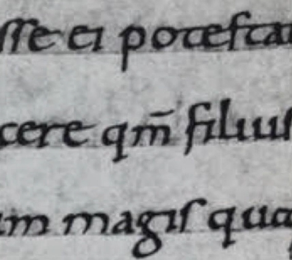
Square capitals can be found in Roman monuments. They have serifs added to the finish of the main strokes. The reed pen held at an angle of approximately 60° off the perpendicular which achieved the variety of stroke width.

Rustic capitals, a compressed version of square capitals, allowed for twice as many words on a sheet of parchment and took far less time to write. The pen or brush was held at an angle of approximately 30° off the perpendicular. Although rustic capitals were faster and easier to, they were slightly harder to read due to their compressed nature.

Both square and rustic capitals were typically reserved for ducuments of some intended performance. Forms were typically written in cursive hand in everyday transactions for speed. The begining can be seen with lowercase letterforms.

Uncials took in some aspects of the Roman cursive hand, especially in the shape of the A, D, E, H, M, U and Q. Uncials are small letters, the board forms of uncials are more readable at small sizes compared to Rustic Capitals.

Half-uncials are a further formalization of the cursive hand, half-uncials mark the formal beginning of lowercase letterforms, with the use of ascenders and descenders.

Charlrmagne , the first unifier of Europe since the Romans, issued an edict in 789 to standardize all ecclesiastical texts. He entrusted this task to Alcuin of York, Abbot of St Martin of Tours. The monks rewrote the texts using both majuscules (uppercase), miniscule, capitalization and punctuation which set the standard for calligraphy for a century.
With the dissolution of Charlemagne's empire came regional variations upon Alcuin's script. In northern Europe, a condense strongly vertical letterform know as Blackletter or textura gained popularity. In the south, a rounder more open hand gained popularity, called 'rotunda'. The humanistic script in Italy is based on Alcuin's miniscule.

Gutenberg marshalled them all to build pages that accurately mimicked the work of the scribe's hand - Blackletter of northern Europe . He invented the movable type, the technology of printing and typography, to produce his Bible widely in a highly productive way.


3. Text type classification

Week 2
a) Typo_3_Text
1. Kerning and letterspacing

kerning: Automatic adjustment of space between letters.
Tracking: The addition and removal of space in a word or sentence.
Letterspacing: To add space between letters.

2. Formatting text
Flush left: Closely mirrors the asymmetrical ecperience of handwriting. Each line start at the same point end wherevern the last word on the line ends. Spaces between the word are consistent throughout the text, allowing the type to create an even gray value.

Centered: Imposes symmetry, equal value and weight to both ends of any line. It transforms fields of text into shapes, thereby adding a pictorial quality. Centered type creates such a strong shape on the page, it's important to amend line breaks so that the text does not appear too jagged.

Flush right: Places emphasis on the end of a line as opposed to its start. It can be useful in situations (like captions) where the relation between text and image mught be ambiguous without a strong orientation to the right.

Justified: Imposes a symmetrical shape on the text. It is achieved by expanding or reducing spaces between words and letters. The resulting openness of line can occasionaly produce 'rivers' of white space running vertically through the text. Careful attention to line breaks and hyphenation is required to amend this problem whenever possible.

3. Texture

4. Leading and line length
Type size: Text type should be large enough to be read easily at arms length--imagine yourself holding a book in your lap.
Leading: Text that is setting too tightly encourages vertical eye movement; a reader can easily loose his or her place. Type that is set too loosely creates striped paterns that distract the reader from the material at hand.
Line length: Appropriate leading for text is as much a function of the line length as it is a question of type size and leading. Shorter lines require less leading; longer lines more. A good rule of thumb is to keep line length is between 55-65 characters. Extremely long or short lines lengths impairs reading.
5. Type specimen bookA typr specimen book shows samples of typefaces in various different sizes. It is to provide an accurate reference for type, type size, type leading, type line length ect.

Typo_4_Text
1. Indecating paragraphs
Pilcrow: A holdover from medieval manuscripts seldom use today.

Line space (leading): If the line space is 12pt, then the paragraph space is 12pt. This ensures cross-alignment across columns of text.


Standard indentation: Typically here the indent is the same size of the line spacing or the same as the point size of your text.

Extended paragraph: It creates unusually wide columns of text. Despite these problems, there can be strong compositional or functional reasons for choosing it.

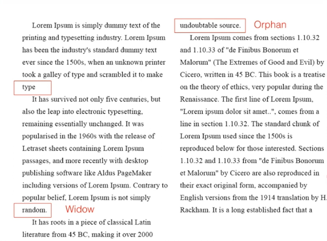
2. Windows and orphans
The unpardonable gaffes in formatting text are windows and orphans.
A window is a short line of type left alone at the end of a column of text. It can be avoided by creating a force line break before or adjusting the tracking of the line before to let the last word in the second last line moves down to the last line.
An orphan is a short line of type left alone at the start of new column. It could be avoided by adjusting the length of the column.
3. Highlighting text
a. Use the same typeface but different fonts (Italic, Bold) or color.


b. Use bold sans serif: Note that a sans serif font usually is slightly larger than a serif font in the same point size. In this example, the sans serif font (Univers) has been reduced by 0.5 pt to match the x-height of the serif typeface.

c. Place a field of color.

d. Place typographic elements (such as bullet points).

e. Use quotation marks: Note that prime is not a quote. The prime is an abbreviation for inches and feet.

4. Headline within text
There are many kinds of subdivisions within the text of a chapter. The following visuals have been labelled (A, B and C) according to the level of importance.
A head indicates a clear break between the topics within a section.

B heads are subordinate to A heads, they indicate a new supporting argument or example for the topic at hand.

C head highlights specific facets of material within B head text. C heads in this configuration are followed by at least an em space for visual separation.


5. Cross alignment
Cross aligning headlines and captions with text type reinforces thearchitectural sense of the page-the structure-while articulating thecomplimentary vertical rhythms. In this example, four lines of captiontype (leaded 9 pts.) cross-align with three lines of text type (leaded to13.5pts).

Week 4
Typo_2_ Basic
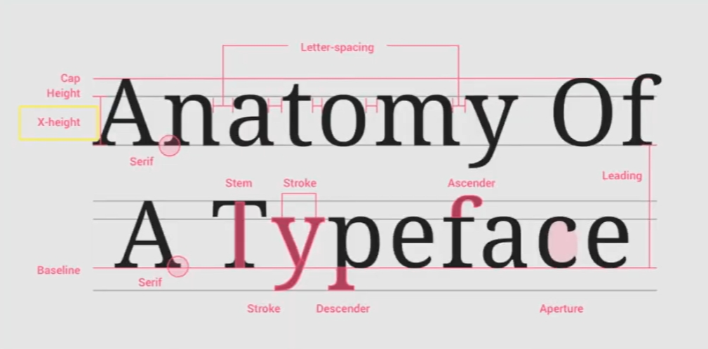
1. Describing letterforms
Baseline: the imaginary line at the base of the letterforms.
Median: the imaginary line defining the x-height of letterforms.
X-height: the height in any typeface of the lowercase 'x'.
Stroke: any line that defines the basic letterform.
Apex / Vertex: the point created by joining two diagonal stems.
Arm: short strokes off the stem of the letterform (horizontal: E, F, L; inclined upward: K, Y).
Ascender: the portion of the stem of a lowercase letterform that projects above the median.
Barb: the half-serif finish on some curved stroke.
Beak: the half-serif finish on the same horizontal arms.
Bowl: the rounded form that describes a counter.
Bracket: the transition between the serif and the stem.
Cross Bar: the horizontal stroke in a letterform that joins two stems together.
Cross Stroke: the horizontal stroke in a letterform that joins two stems together.
Crotch: the interior space where two strokes meet.
Descender: the portion of the stem of a lowercase letterform that projects below the baseline.
Ear: the store extending out from the main stem or body of the letterform.
Em/en: originally referring to the width of an uppercase M, and em is now the distance equal to the size of the typeface; an en is half the size of an em.
Finial: the rounded non-serif terminal to a stroke.
Leg: short stroke off the stem of the letterform (at the bottom: L; inclined downward: K, R).
Ligature: the character formed by the combination of two or more letterforms.
Link: the stroke that connects the bowl and the loop of a lowercase G.
Loop: the bowl created in the descender of the lowercase G (in some typefaces).
Serif: the right-angled or oblique foot at the end of the stroke.
Shoulder: the curved stroke that is not part of a bowl.
Spine: the curved stem of the S.
Spur: the extension that articulated the junction of the curved and rectilinear stroke.
Stem: the significant vertical or oblique stroke.
Stress: the orientation of the letterform, indicated by the thin stroke in round forms.
Swash: the flourish that extends the stroke of the letterform.
Tail: the curved diagonal stroke at the finish of certain letterforms.
Terminal: the self-contained finish of a store without a serif, it may be flat, flared, acute, grave, concave, convex or rounded as a ball or a teardrop (see finial).

2. Font
Uppercase: Capital letters, including certain accented vowels, the ccedilla and n tilde, and the a/e and o/e ligatures.

Lowercase: Lowercase letters include the same characters as uppercase.

Small Capitals: Uppercase letterforms draw to the x-height of thetypeface. Small Caps are primarily found in serif fonts as part of whatis often called expert set.
Most type software includes a style command that generates a smallcap based on uppercase forms. Do not confuse real small caps withthose artificially generated.

Uppercase Numerals: Also called lining figures, these numerals arethe same height as uppercase letters and are all set to the samekerning width. They are most successfully used with tabular materialor in any situation that calls for uppercase letters.

Lowercase Numerals: Also known as old style figures or text figuresthese numerals are set to x-height with ascenders and descenders.They are best used when ever you would use upper and lowercaseletterforms,Lowercase numerals are far less common in sans seriftype-faces than in serif.

ltalic: Most fonts today are produced with a matching italic. Smallcaps, however, are almost always only roman. The forms in a italicrefer back to fifteenth century ltalian cursive handwriting. Oblique aretypically based on the roman form of the typeface.

Punctuation, miscellaneous characters: Although all fonts containstandard punctuation marks, miscellaneous characters can changefrom typeface to typeface, lt's important to be acquainted with all thecharacters available in a typeface before you choose the appropriatetype for a particular job.

Ornaments: Used as flourishes in invitations or certificates. Theyusually are provided as a font in a larger typeface family. Only a fewtraditional or classical typefaces contain ornamental fonts as part ofthe entire typeface family (Adobe Caslon Pro).

Roman: Uppercase forms are derived from inscriptions of Roman monuments. A slightly lighter stroke in roman is known as ‘Book’.
Italic: Named for 15th century Italian handwriting on which the forms are based. Oblique conversely is based on the roman form of typeface.
Boldface: Characterized by a thicker stroke than a roman form. It can also be called ‘semibold’, ‘medium’, ‘black’, ‘extra bold’, or super.
Light: A lighter stroke than the roman form. Even lighter strokes are called ‘thin’.
Condense: A version of the roman form, and extremely condense styles are often called ‘compressed’.
Extended: An extended variation of a roman font.

4. Comparing typefaces
We are to use the 10 typefaces below throughout this module. These 10 typefaces represent 500 years of type design. Each typeface gives different feelings, it is important for us to understand these typefaces well and choose the right typeface for conveying messages in a particular work.

INSTRUCTIONS
Task 1: Exercises - Type Expression
For Exercise 1, we were given six words to make type expressions. We are required to choose four words from Smile, Jump, Break, Sleep, Fly, Dive and then sketch out the meaning of the words. We are not encouraged to use too many graphical elements, but several dots and lines are allowed to help with type expression.
a) Sketches
I have chosen the words Break, Jump, Sleep, Fly for thetype expression sketches.

Break: I created a feeling of fragmentation by dividing a complete letter into multiple pieces.
Jump: I made the fonts distorted and rounded to express the feeling of jumping in the air.
Sleep: I created a sleepy feel by having the letters tilted or even completely tipped over.
Fly: I distort the shapes of the letters to create a sense of chaos and freedom in flight.
b) Digitisation
During the digitisation process, I have tried out several attempts to create the right expression for each word based on my sketches with the typefaces provided. I have a rough digitisation work by having lots of attempts at trying different typefaces. Later on, I worked in more detail with it and recorded the process of digitisation. I inserted the process of the main designs of each word.

BREAK:
The font I used for digitising the word BREAK#1 is Gill Sans_Condensed.
The font I used for digitising the word BREAK#2 is Futura_Bold.

SLEEP:
The font I used for digitising the word SLEEP#1 is Futura_Extra Bold.
The font I used for digitising the word SLEEP#2 is Futura_Light.

FLY:
The font I used for digitising the word FLY#1 is Gill Sans_Regular.
The font I used for digitising the word FLY#2 is Gill Sans_Shadowed.

JUMP:
The font I used for digitising the word JUMP#1 is Gill Sans_Bold Condensed.
The font I used for digitising the word JUMP#2 is Gill Sans_Ultra_Bold.

Final Task 1 - Exercise 1: Type Expressions
-01.jpg)
Fig. 5. 8 Final Type Expression - PDF, Week 3
c) Type Expression AnimationWe have to choose one from the four final type expressions to make an animated type expression. I chose the word BREAK for the animation. Before we start to do the animation, we have to watch the animation tutorial video made by Mr Vinod. In the video, Mr Vinod demonstrated how to make an animation step by step using Illustrator and frame animation in Photoshop. He advised us to think about how the word would animate in each frame.
At first, I only used 8 frames to complete the whole animation, but in the later class, the tutor Mr. Max told us that the animation needs at least 15 to 20 frames. So I added the picture of falling letters. And Mr. Max thought that the impact force of the letter B was unreasonable. He suggested that I let the letter B appear outside the artboard to make the animation more reasonable.

According to the tutor's advice, I deformed the letter B and was thrown in from outside the picture. After hitting other letters, they began to crack and fall, so as to show the meaning of break.

Final Animation


For Exercise 2, we have to create a final layout of text formatting, working with typefaces, type size, leading, line length, etc. Before that, we have to learn and work with kerning and tracking.
2. Layout exercise
We are to create a final layout using the texts given and work with the text formatting setting. Black and white photography should be added to the layout with a caption. Throughout this exercise, we could have a better understanding of text formatting and be more sensitive to the details in creating a good layout.
One of my layouts are approved to perfect as the final work.

HEAD LINE
Font/s: Bembo Std
Type Size/s: 72 pt
Leading: 36 pt
Paragraph spacing: 0
BODY
Font/s: Bembo Std
Type Size/s: 9 pt
Leading: 11 pt
Paragraph spacing: 11 pt
Characters per-line: 57
Alignment: left justified Margins: 123 mm top, 26 mm left + right + bottom
Columns: 2
Gutter: 10 mm

Final Task 1: Exercise 2 - Text Formatting

HEAD LINE
Font/s: Bembo Std
Type Size/s: 72 pt
Leading: 36 pt
Paragraph spacing: 0
BODY
Font/s: Bembo Std
Type Size/s: 9 pt
Leading: 11 pt
Paragraph spacing: 11 pt
Characters per-line: 57
Alignment: left justified Margins: 123 mm top, 26 mm left + right + bottom
Columns: 2
Gutter: 10 mm
FEEDBACK
Experience
Observations
Findings

Based on the list of recommended readings in the module information booklet, I did some further reading with the book "Typographic design: Form and communication".
This book provides readers with a concise and comprehensive overview of information, vocabulary, tools and effective methods used in layout design practice.
Typography is the evolution of written words, so it has participated in the history of visual communication that has lasted for thousands of years. In the context of world historical and artistic historical events, this evolution is presented in the form of a timeline, tracing the development from manual to mechanical to digital practice.
The following chapters include the history and anatomy of typography; the principles of visual organisation and legibility; cross-study of form, meaning and media; projects exploring various backgrounds; and case studies dedicated to the traditional and non-traditional typography design process.

The book is rich in visual examples showcasing early historic type, various type development and changes in styles throughout the ages.

The twentieth century is a period of incredible fermentation and change. The unprecedented progress of science and technology, as well as the revolutionary development of art and design, have left traces in typography.

Font design is a complex human activity that requires a wide range of background knowledge. This chapter discusses the basic language of font design. Fonts are the basic components of all printing communication and need to be carefully checked. Terms, measurements, and the nature of printed fonts and homes.

Readability is achieved by controlling the quality and attributes inherent in font design that make the font readable. These attributes enable readers to understand the printing form with minimal difficulty.


.png)
Comments
Post a Comment