Advanced Typography | Task 3
13/11/2024 - 11/12/2024 Week 8 - Week 12
Gao Yuan Yi 0373945
GCD61004 Advanced Typography / Bachelor of Design (Hons) in Creative Media / Taylor's University
Task 3 Type Exploration and Application
INSTRUCTIONS
Task 3 - Type Exploration and Application
We are required to create a complete font set for this task, three main directions are given as such:
1. Create a font that is intended to solve a larger problem or meant to be part of a solution in the area of your interest be it graphic design, animation, new media or entertainment design or any other related area not necessarily reflecting your specialisation. End result: a complete generated font (.ttf) with applications.
2. Explore the use of an existing letterform in an area of interest, understand its existing relationship, identify areas that could be improved upon, explore possible solutions or combinations that may add value to the existing letterform / lettering. End result: a complete generated font (.ttf) with applications.
3. Experiment. For your idea to qualify as an experiment it must be novel and unique — working with material that might be 3- dimensional, digitally augmented, edible, unusual, typographic music video or fine art. End result: defined by student.
1. Proposal
2. Letters Design
After the tutorial, I decided continue my programme with the first idea. So I started exploring design of other letters.


4. Font Presentation

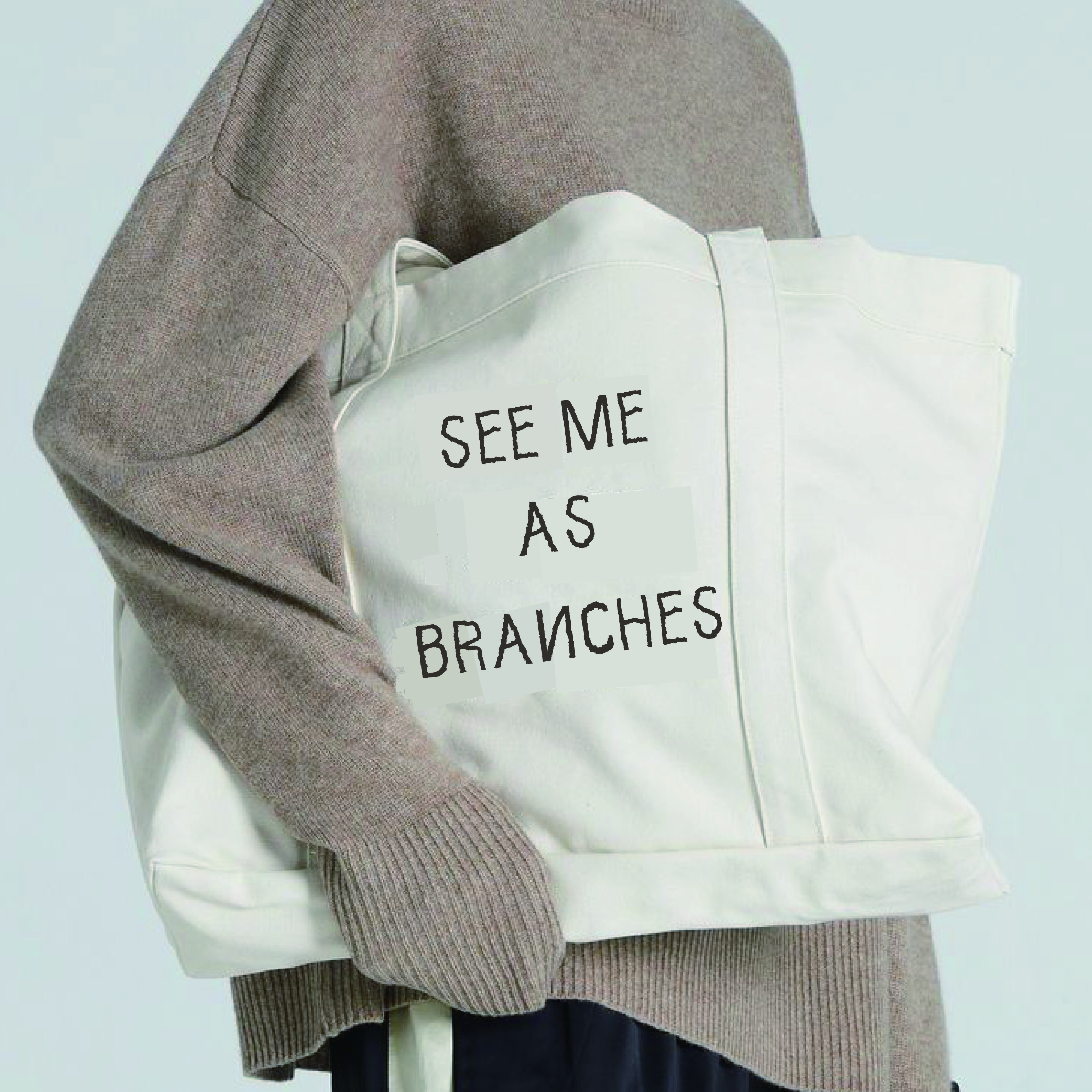
Finalised Font Presentation Work


FEEDBACK
Week 8
REFLECTION
In Task 3 of Advanced Typography, I worked on creating a complete font design. At first, my font looked too similar to the reference font. Vinod pointed out that I didn’t need to rely on the reference anymore and encouraged me to make the font more original. With that advice, I adjusted my design to give it a unique style. I used Adobe Illustrator for the sketches and later refined and exported the font using FontForge. This process involved a lot of trial and error, but it helped me improve step by step.
I noticed how important it is to balance inspiration and originality. At the start, it was easy to rely too much on the reference font, but I realized that making something truly unique is the real challenge. I also learned that small details matter, like making sure all the letters and symbols are the right size and match each other. Tools like FontForge were very helpful because they showed me the small mistakes that I didn’t notice at first.
Through this task, I realized that designing a font is not just about being creative – it also needs a lot of focus on details. Feedback from Vinod showed me what I needed to fix and helped me see things more clearly. I also gained more confidence in using design tools like Adobe Illustrator and FontForge. Overall, I learned how important it is to take my time, listen to feedback, and keep improving.
FURTHER READING

Based on the list of recommended readings in the module information booklet, I did some further reading with the book "Typographic design: Form and communication".
This book provides readers with a concise and comprehensive overview of information, vocabulary, tools and effective methods used in layout design practice.

The structure of typographic space can be deffned by alignments and form-to-void relationships that establish a composition's underlying spatial order. This substructure is developed and enhanced through optical adjustment. Often inconspicuous, optical adjustment is the precise visual alignment of typographic elements in space based not on mathematical but on perceptual alignment. The designer's understanding and use of optical adjustment is necessary for visual clarity. Visual compensation and optical adjustment within the typographic space link printed elements and the spatial ground. This structural integration is not an end in itself; its order, simple or elaborate, acts as a stimulus, controlling the visual dynamics of the message transmission and response.

A visual hierarchy is an arrangement of elements in a graduated series, from the most prominent to the least prominent, in an area of typographic space. When establishing a visual hierarchy, a designer carefully considers the relative importance of each element in the message, the nature of the reader, the environment in which the communication will be read, and the need to create a cohesive arrangement of forms within the typographic space. The study of visual hierarchy is the study of the relationships of each part to the other parts and the whole. When elements have similar characteristics, they have equality in the visual hierarchy, but when they have contrasting characteristics, their differences enable them to take dominant and subordinate positions in the composition. Contrast between elements within the space is achieved by carefully considering their visual properties. Important contrasts used to create hierarchical arrangements include size, weight, color, and spatial interval. The location of an element within the space plays an important role in establishing a visual hierarchy. The spatial relationships with other elements can also inffuence an element's relative importance in the arrangement.


.png)
Comments
Post a Comment